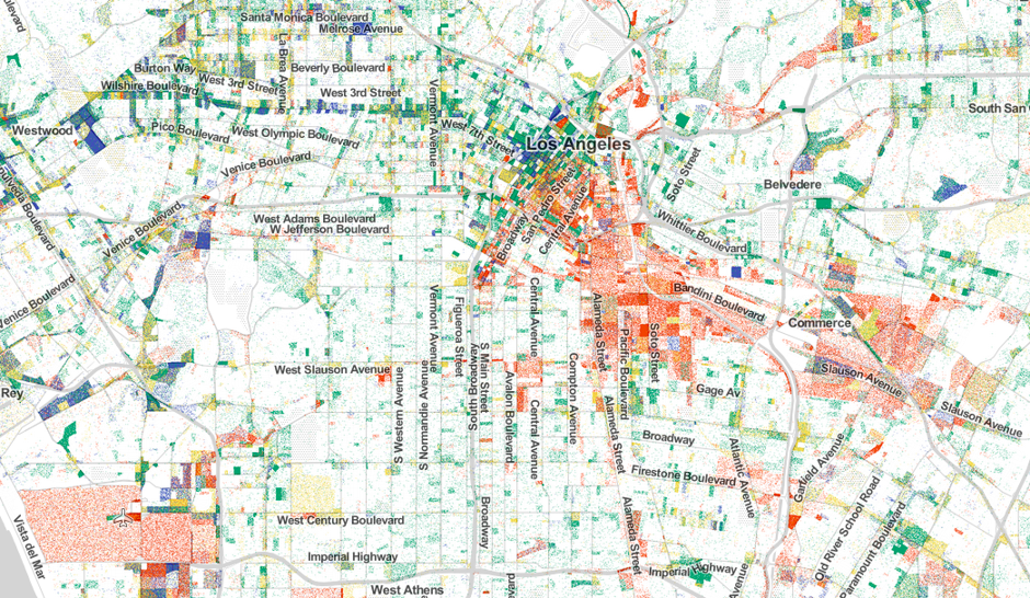
The red dots illustrate how manufacturing jobs are still plentiful in the Los Angeles, California, area. (Map created by Robert Manduca)
A nifty map pinpoints practically every job in the United States, revealing the economic character of America’s metropolitan areas, which also helps to inform the local culture.
The interactive graphic, created by Harvard PhD student Robert Manduca, is made up of color-coded dots: red represents manufacturing and logistics, blue is professional services, green is healthcare, education and government, and yellow is retail, hospitality and other services.
“These kinds of maps are great when you’re talking about individuals,” Manduca told CityLab. “Especially when you’re talking about jobs, because jobs are more concentrated than people. It gets across how tightly packed they are in many U.S. cities.”
Washington, D.C. area
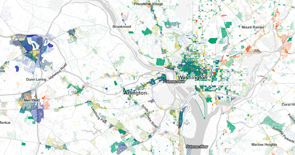
Washington, D.C. area (Map created by Robert Manduca)
When you zero in on Washington, D.C., the seat of the U.S. government, it’s no surprise that green dots dominate the landscape. Overall, there are 2,711,000 federal workers — not including non-civilian military — and 521,300 of those jobs are in the Washington area.
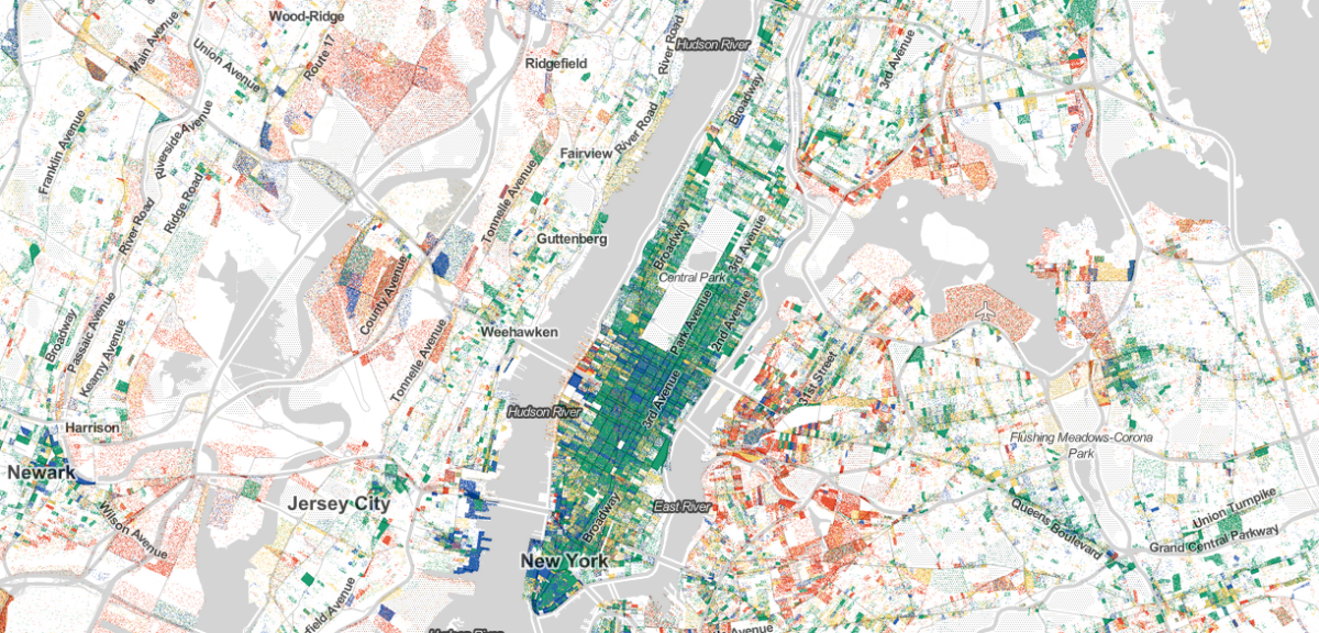
New York area
New York area (Map created by Robert Manduca)
The map shows lots of green and blue in the New York area, home to Wall Street, which is known as a key financial hub.
Houston, Texas area
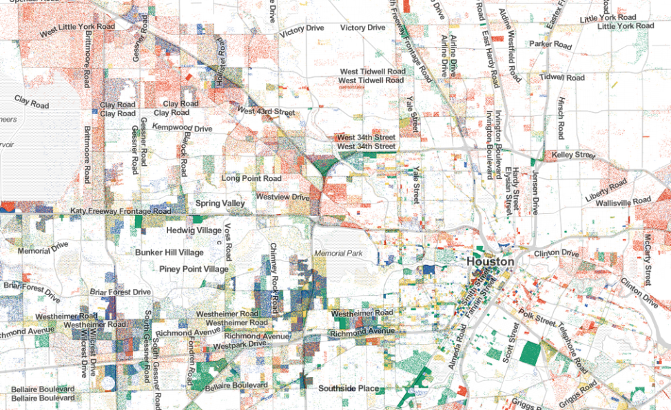
Houston, Texas area (Map created by Robert Manduca)
Red dots — manufacturing and logistics jobs — are plentiful in the areas of Miami, Florida, and Houston, Texas,
Miami, Florida area
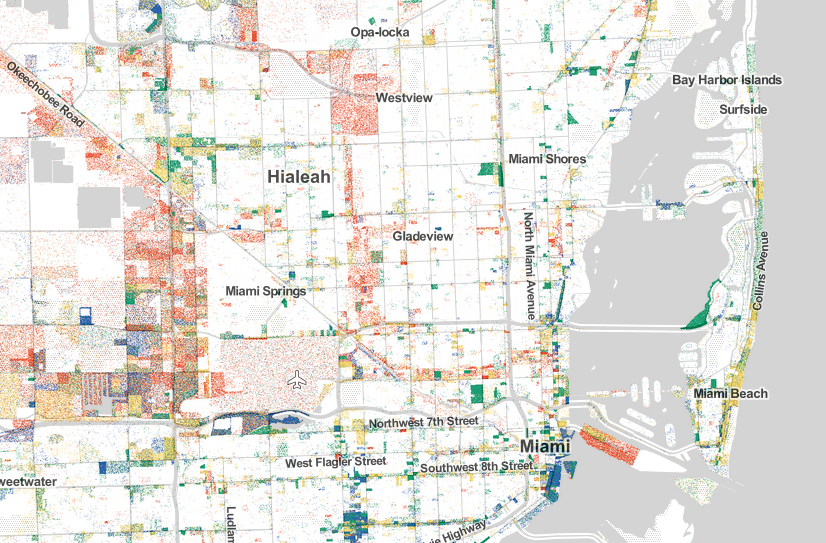
Miami, Florida area (Map created by Robert Manduca)
Las Vegas, Nevada area
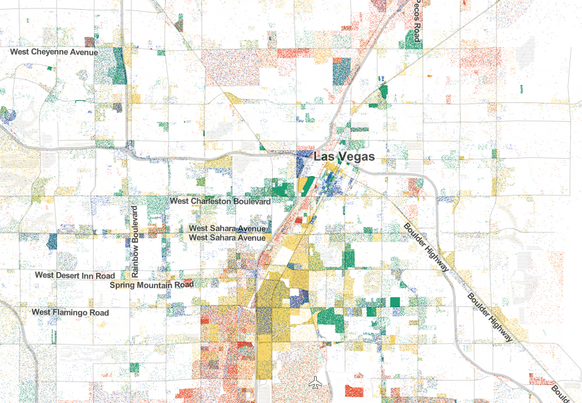
Las Vegas, Nevada area (Map created by Robert Manduca)
Yellow dots — representing retail and hospitality — show tourism fuels the economy in Las Vegas, Nevada.
To make his map, Manduca used employer-reported data from the U.S. Census. See the full interactive map here.