A new map shows the American landscape gets pinker and pinker as we age, with women outliving men in most parts of the country.
Using data from the U.S. Census, Dadaviz’s Jishai Evers created a map that starts off more blue (for males) than pink (for females).
Statistics show the chances of being born male in the United States are slightly higher (51.2 percent) than the chances of being born female, which means that for every 1,050 boys born, 1,000 girls will be born.
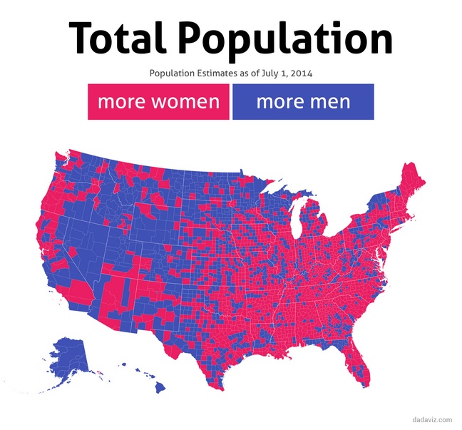
Courtesy dadaviz.com
The map goes pink over time because women live longer than men, according to the CIA World Factbook. American women have a life expectancy of 81.97 years while men are expected to live 77.32 years.
A June 2015 report in the U.S. Proceedings of the National Academy of Sciences (PNAS) suggests smoking and an increased risk of heart disease are behind the higher mortality rates among American men as they age.
Due to these higher death rates, there are more women than men in 39 states, and U.S. women outnumber men overall, making up 50.8 percent of the population, according to 2013 U.S. Census data.
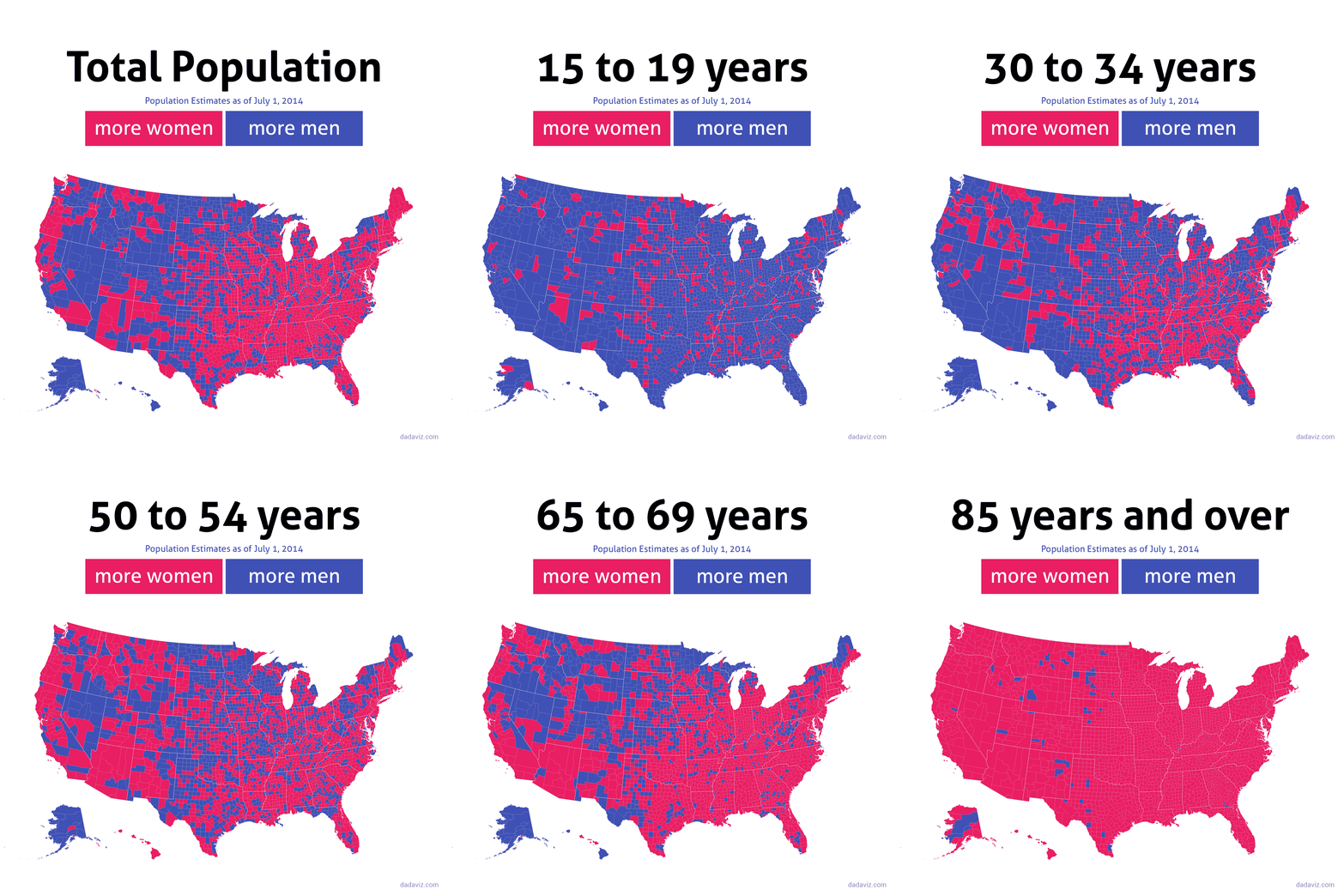
Courtesy dadaviz.com











Ms. Dora,
Report is good. Is it done through survey or any other method?
The map was created using data from the US Census, which collects data on all people who live in the United States.