

FILE — An ambulance drives near University Hospital of Newark in Newark, New Jersey. (AP Photo)
.
One-third of Americans die from respiratory diseases, like the flu, while older Americans are much more likely to die from cancer.
There are many ways that people die and the Centers for Disease Control and Prevention (CDC) breaks those ways down into 113 causes, and then groups them into 20 categories of diseases and external causes. This CDC data has been charted in an interactive graphic by Nathan Yau at Flowing Data.
.
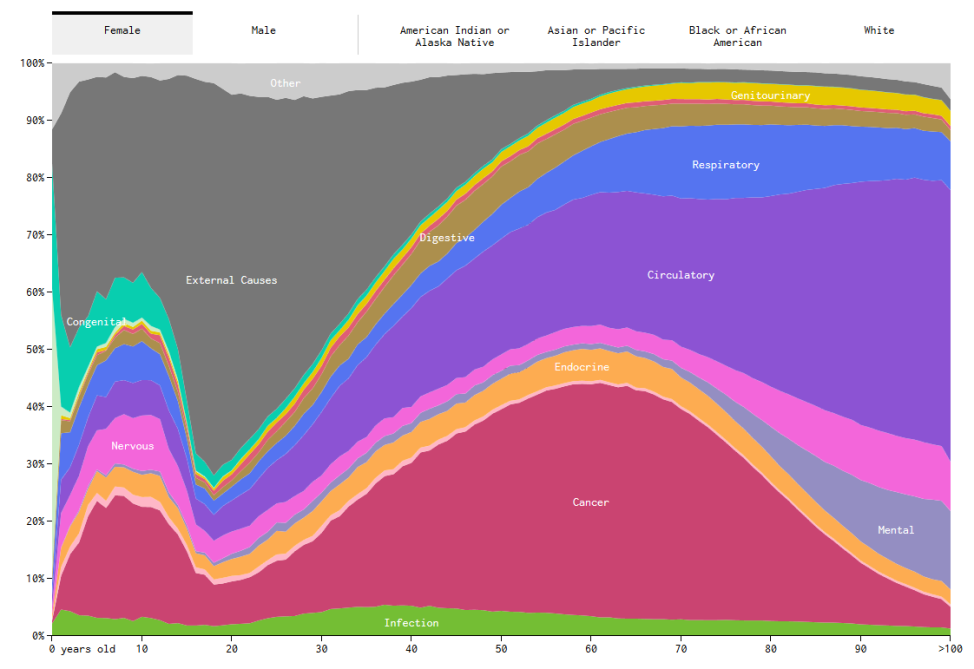
Causes of death for women (Nathan Yau/Flowing Data)
.
The height of any color wave in the chart represents the percentage of people who died of a particular cause at a specific age. For example, of the women who died at age 60, 40 percent of them died of cancer.
For young people in their teens and twenties, external causes of death, like car accidents or drug overdoses, are far more likely. For women, these external causes account for about 5 percent of deaths. However, the number is much higher for young men, who are twice more likely to die from external causes than women.
.
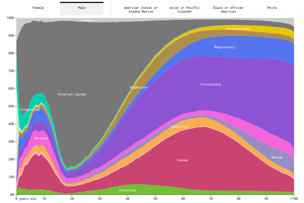
Causes of death for men (Nathan Yau/Flowing Data)
.
The charts show that the very old and the very young are more likely to die from disease. For example, more than 20 percent of boys and girls who die at age 10 succumb to cancer.
Yau also charted deaths by race and found that African Americans are more likely to die from disease at a younger age than whites are. The same is true of Asian Americans and Pacific Islanders.
.
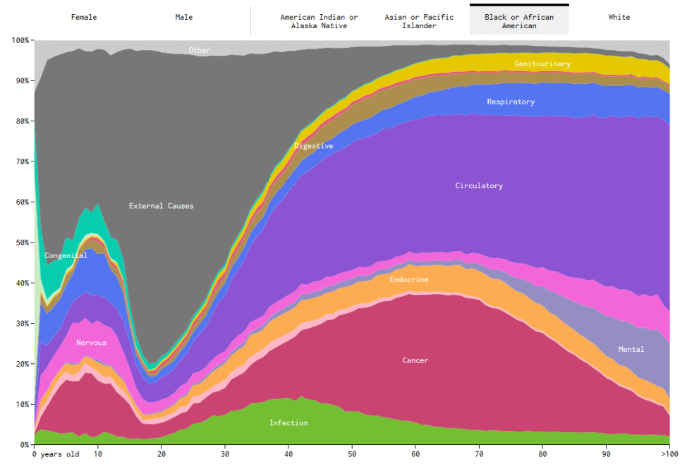
Causes of death for Black/African Americans (Nathan Yau/Flowing Data)
.
You can view the complete interactive chart here.
Yau also used CDC data to determine how and when Americans will die, given their sex, race, and age. You can see that interactive chart here.