Crowds jam Chinatown during a Chinese New Year festival, Feb. 20, 2016, in San Francisco, California, which has a GDP of $412 billion. (AP Photo)
Wealth and influence are concentrated in certain areas of the United States and a new animated map shows just how mammoth some local economies are when compared on a national scale.
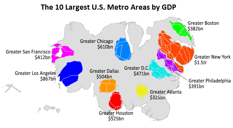
Metrocosm’s Max Galka created the map, which shows every U.S. county in proportion to its share of the total U.S. GDP (gross domestic product). Galka’s map becomes distorted once the powerhouse economies of certain metropolitan areas, such as New York, Los Angeles and Houston, are adjusted according to their money and influence.
The GDP of every U.S. county

The major urban centers in the United States don’t just have the largest GDP — which is the total value of goods produced and services provided in a country during one fiscal year — they also have stronger economies than entire countries.
Galka points out that the greater New York area’s economy of $1.5 trillion surpasses that of 11 nations, including Australia and South Korea, and ranks just below Canada and Russia. Atlanta sits at the bottom of the U.S. economic top 10, but if it were a country, Atlanta would rank among the top 50 economic powerhouses in the world, below Denmark and Malaysia but above Singapore and Israel.

Max Galka, Metrocosm.com
More About America:
Poll Finds Young Americans Are ‘Frightening’ Liberal
Who’s Losing Out on the American Dream?
Rare 1903 Footage Captures Busy Boston Streets
How Diversity Has Changed America
Americans Can’t Always Name That President


I like the info and unique graphic that does a good job showcasing that same data; however, try to add your sources of information.
How can California be the poorest state when, according to the stats it’s somewhere in the middle?